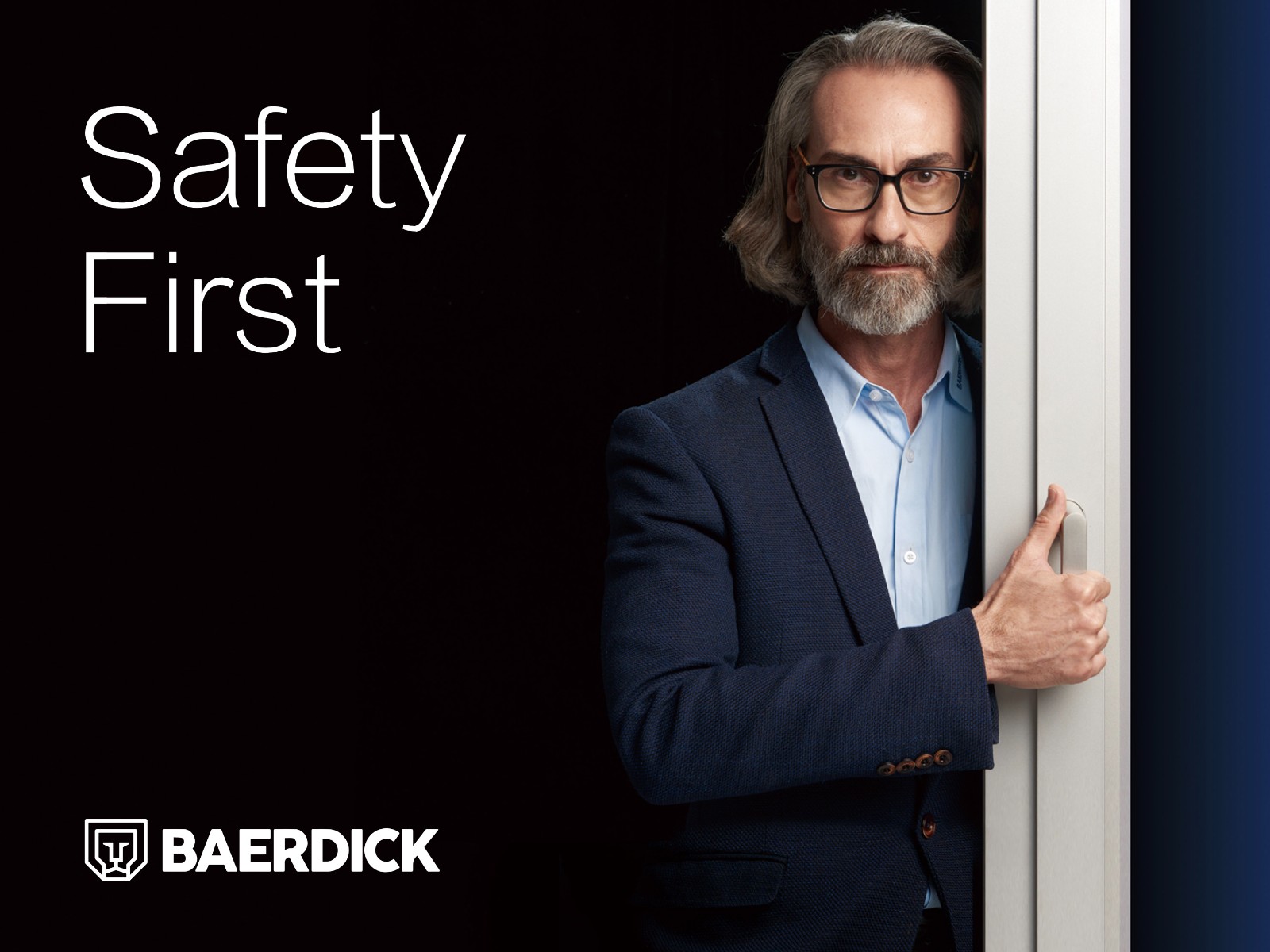
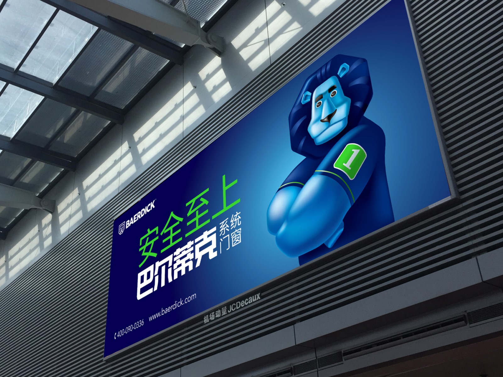
巴尔蒂克:安全至上
Baerdick:Safety First
门窗的安全性是消费者购买的重要原因,通过市场研究,我们将巴尔蒂克系统门店的核心价值定位为“安全至上”,并以此指引产品研发、市场营销等经营活动,帮助该品牌建立与众不同的形象。
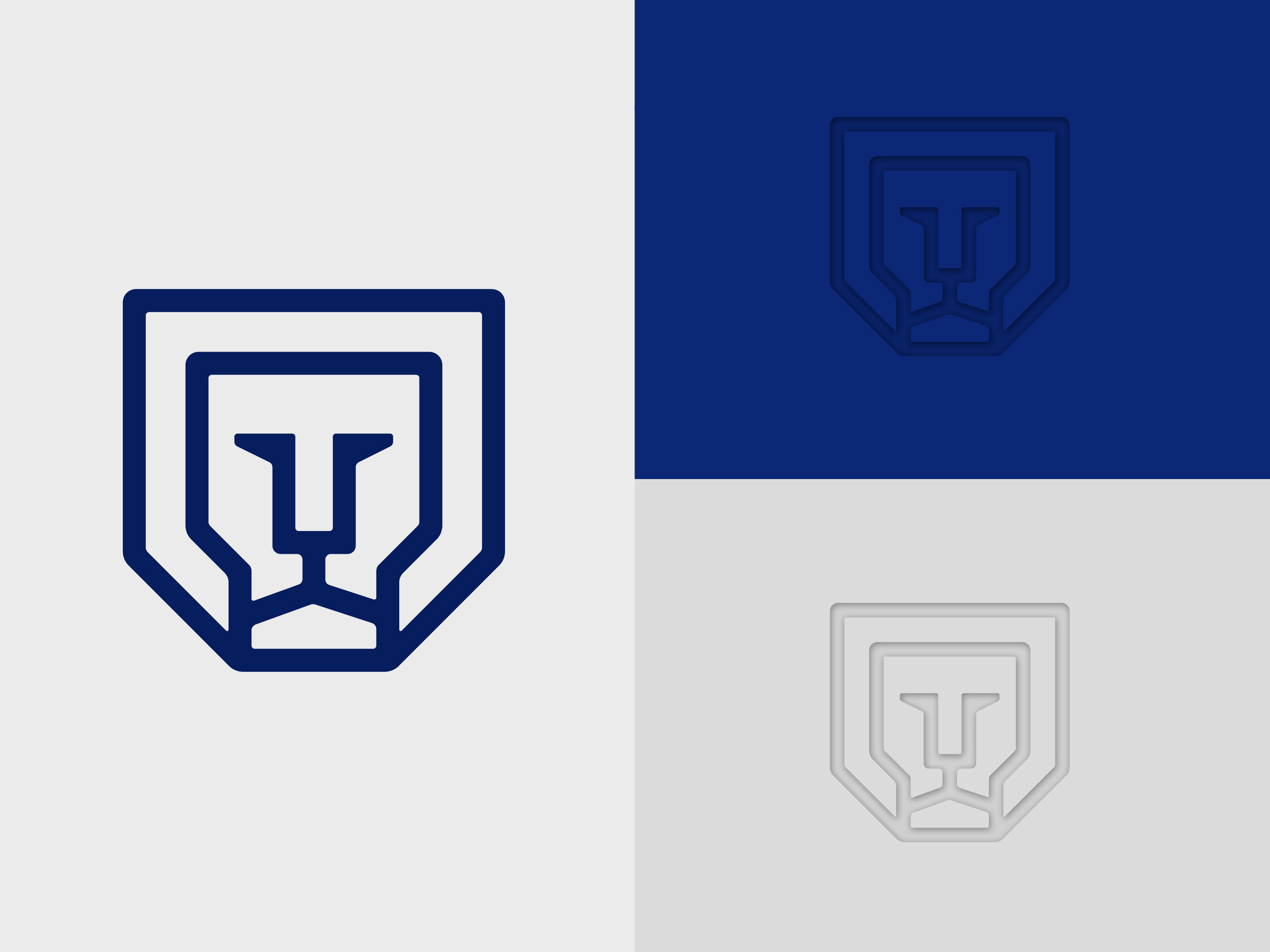
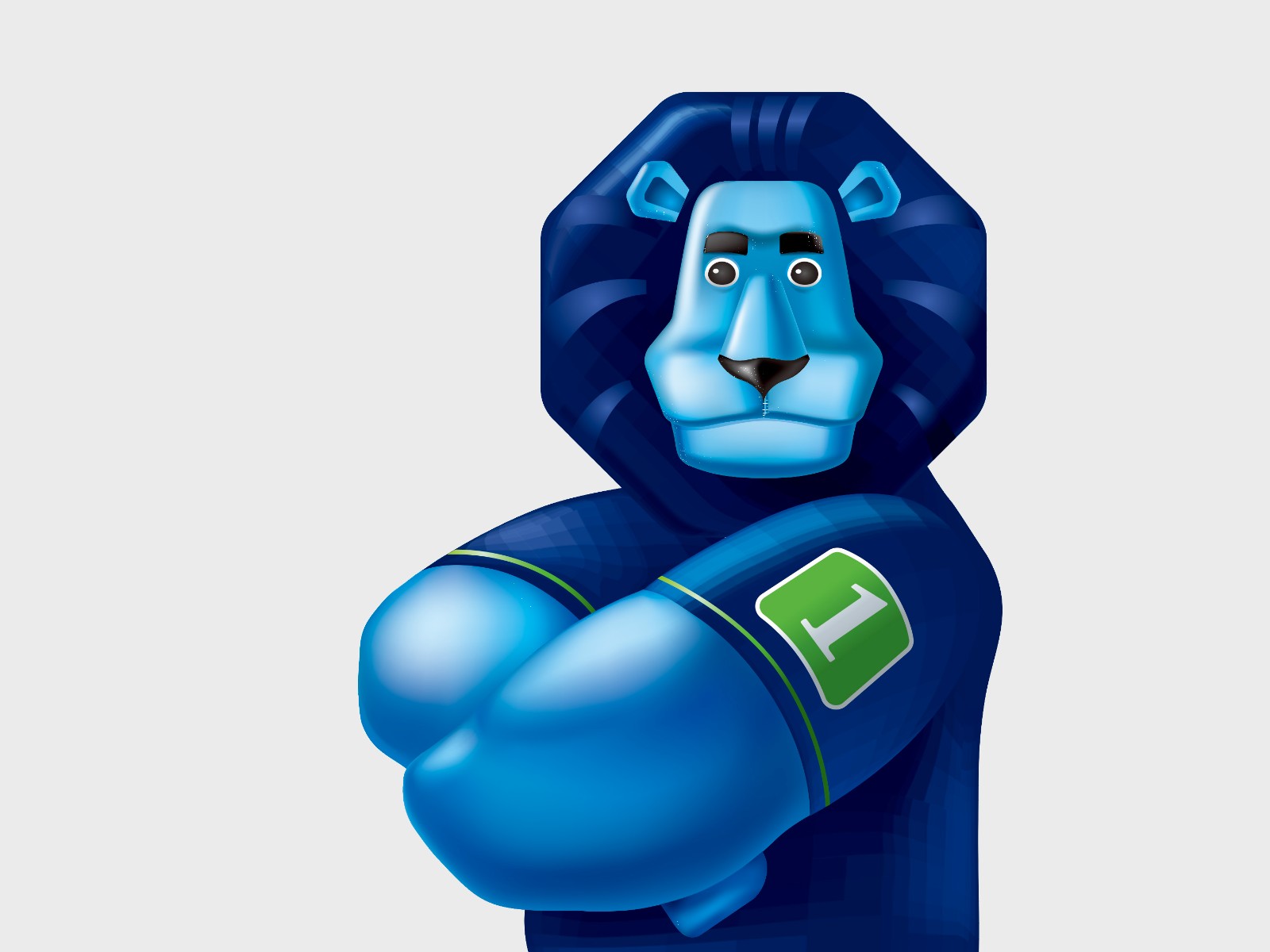
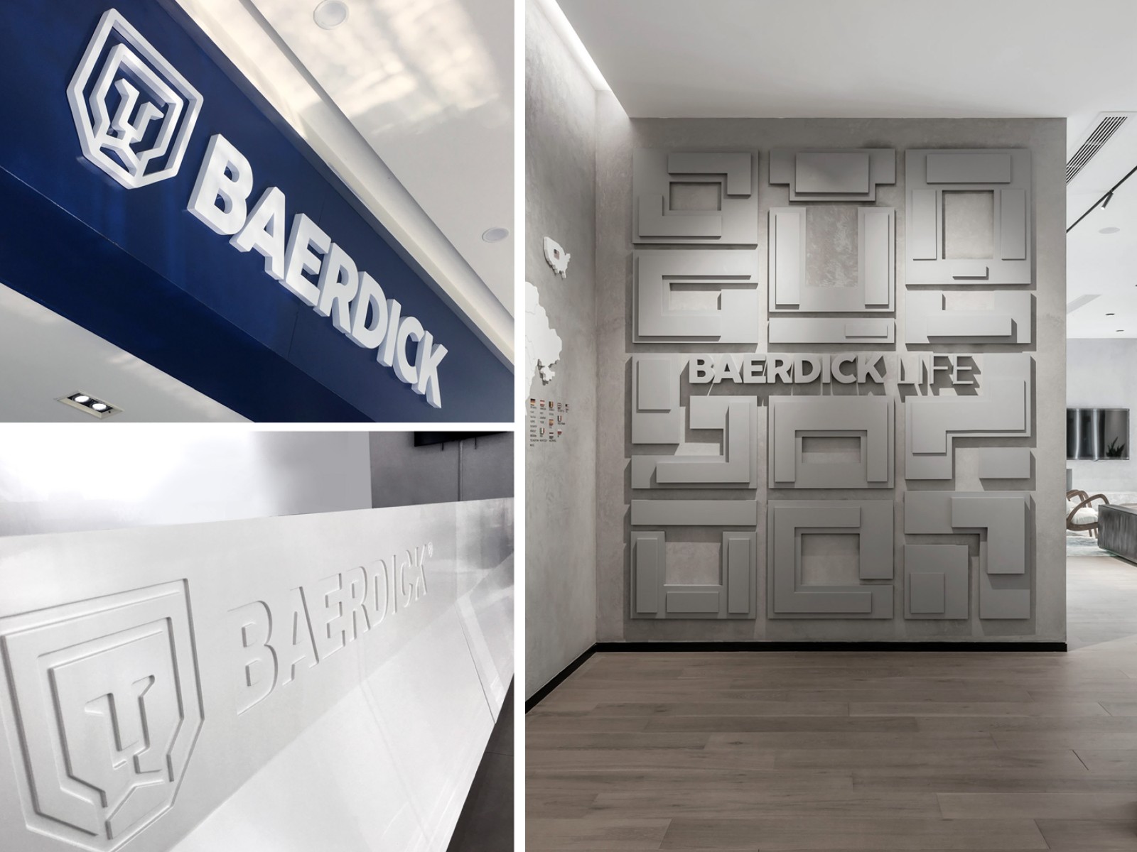
BAERDICK的新徽标显示了狮子的蓝色面孔的抽象插图,通常在中国传统豪宅的门环中看到。徽标的几何线条将主题图案简化为基本要素,以便与产品的特性建立紧密的联系。至关重要的是,保持所有视觉图像对品牌的重塑高度一致且一致。因此,徽标的结构及其在各种广告媒体中的应用都强调在整个公司设计中的简洁性,质量和可靠性。
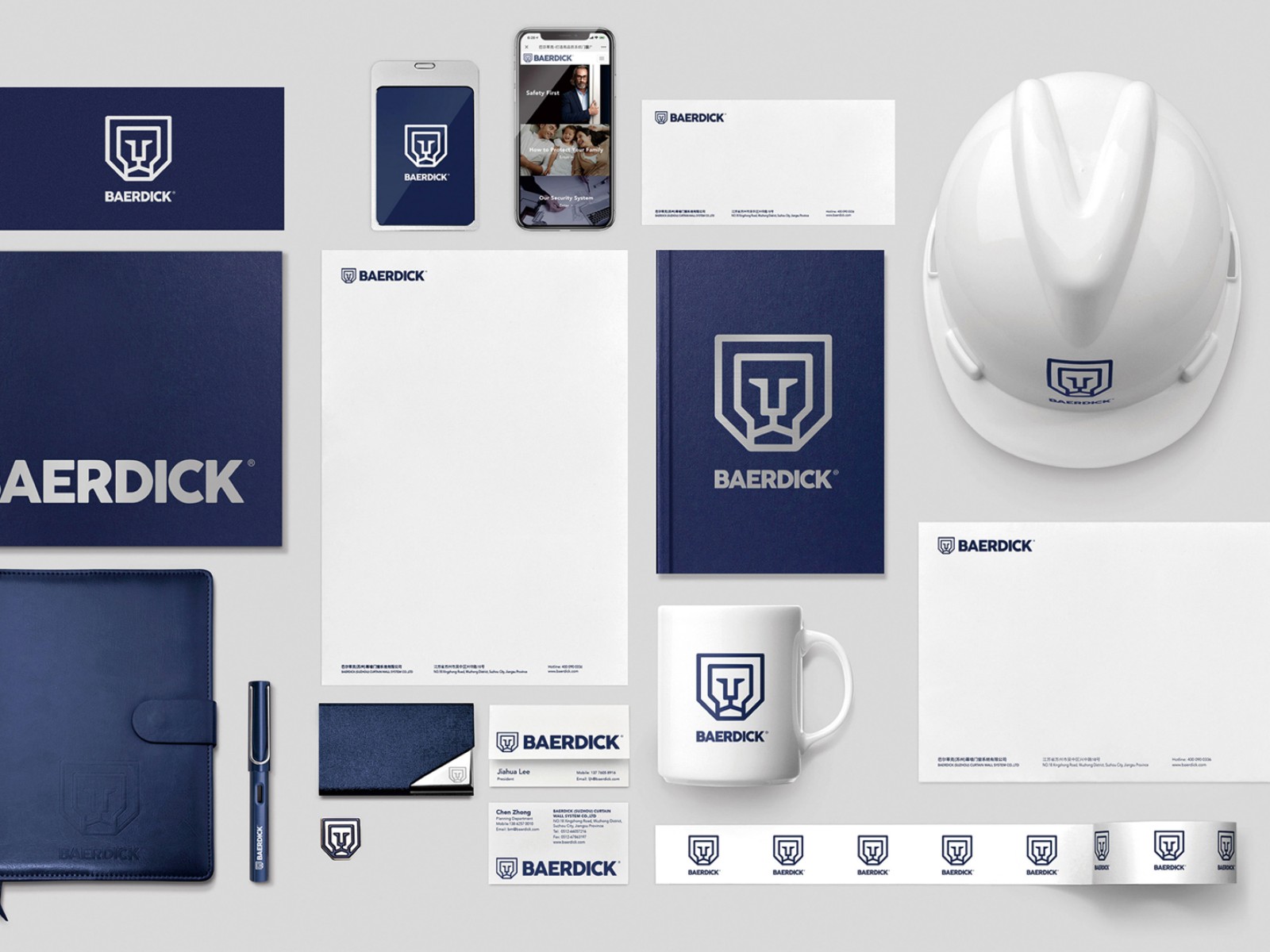
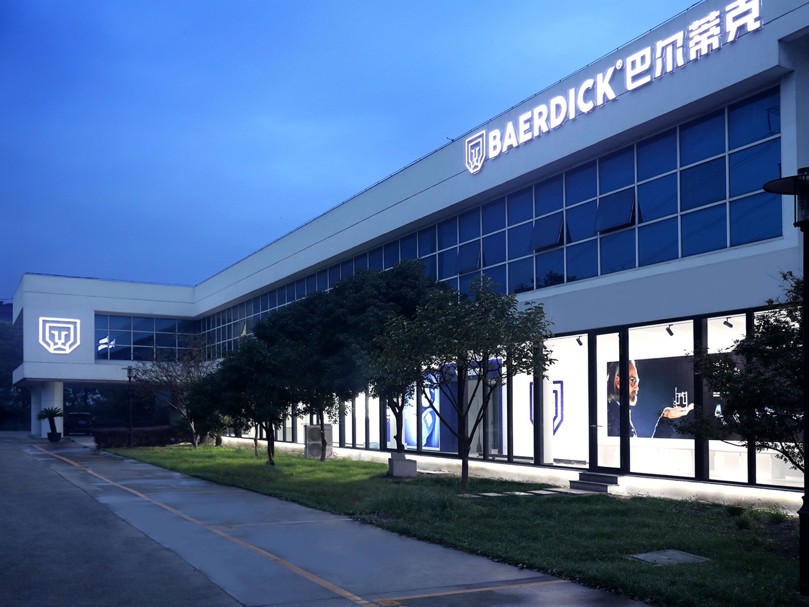
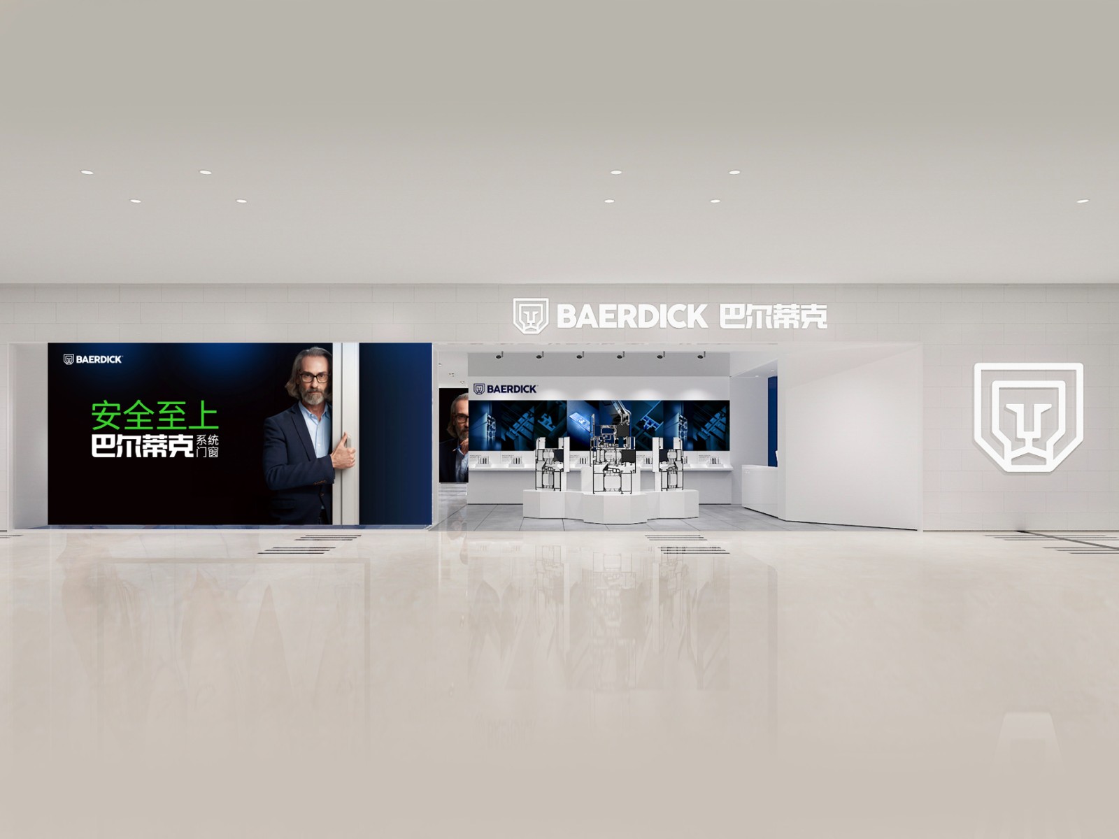
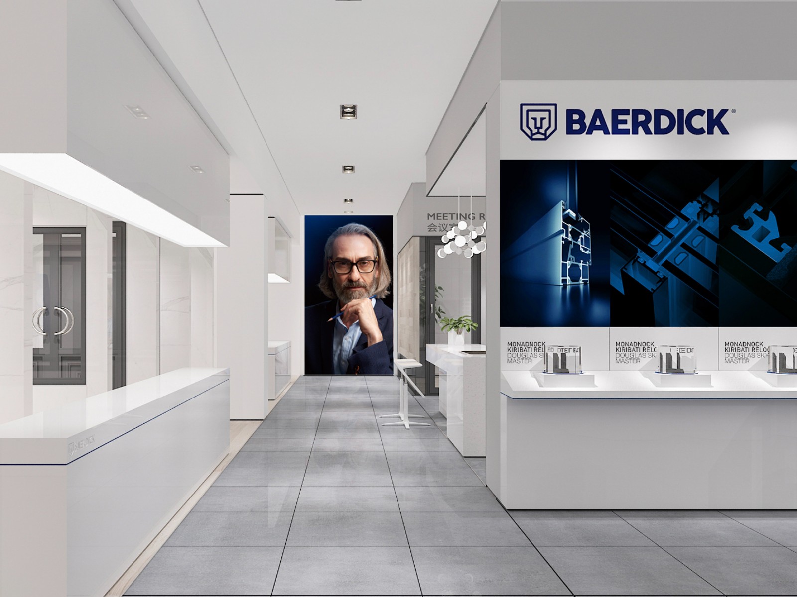
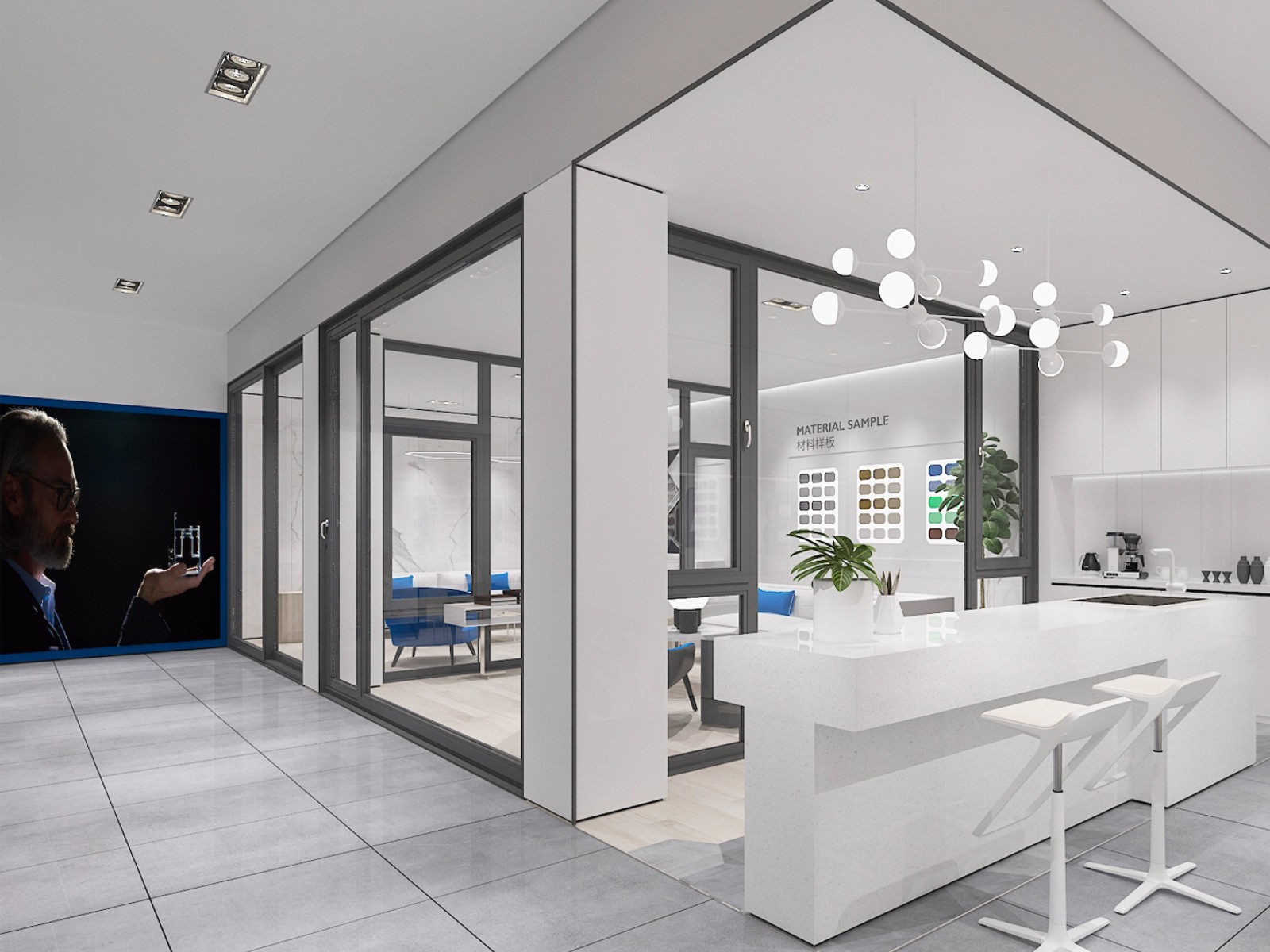
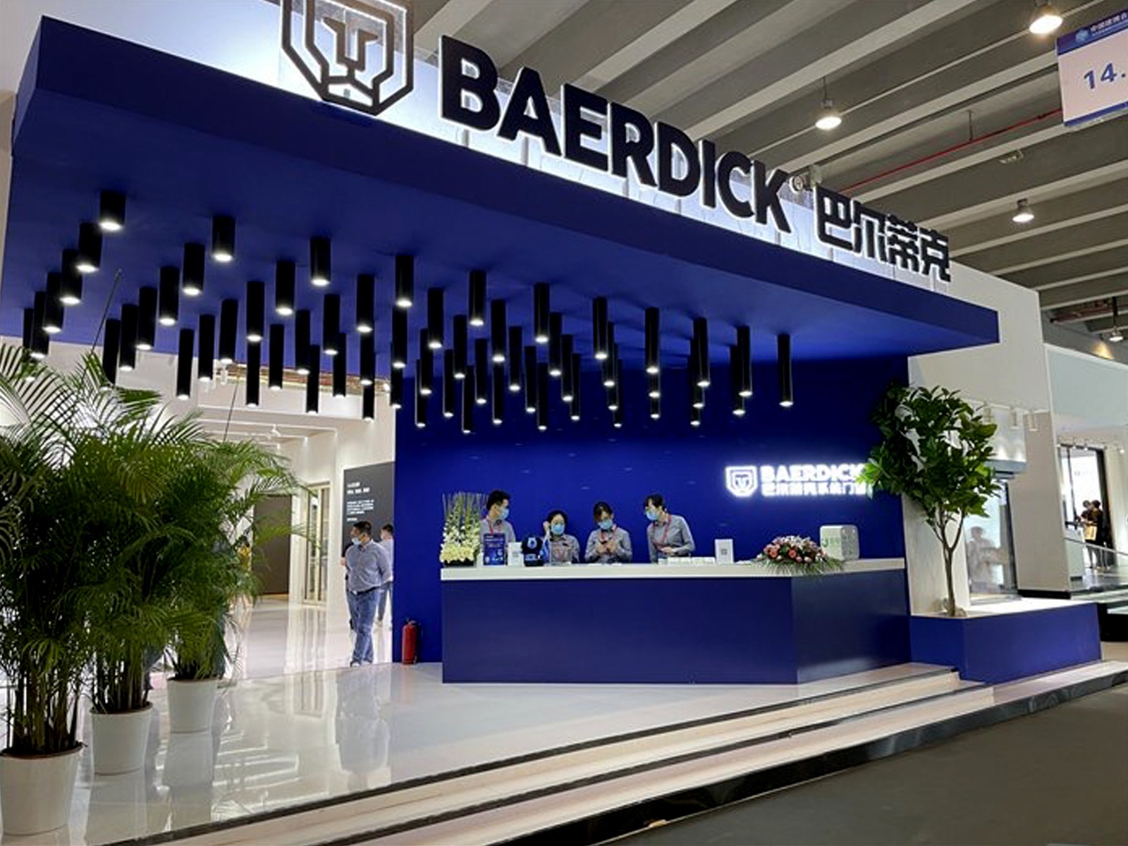
从色彩、标识到IP,从销售工具、户外广告到展厅,贤草帮助巴尔蒂克在各个接触点都完成了落地,使得巴尔蒂克成为门窗行业令人瞩目的品牌。
Positioned as a brand which is primarily concerned with safety, the new logo of BAERDICK shows the abstract illustration of the blue face of a lion, commonly seen in the door knockers of traditional Chinese mansions. The logo’s geometric lines reduce the motif to the essentials in order to establish a close correlation with the characteristics of the product. It is crucial to keep all the visual images for the reshaping of the brand highly identical and consistent. Therefore, briefness, quality and reliability are emphasised throughout the entire corporate design, both in the structure of the logo as well as in its application in various advertising media.
客户:巴尔蒂克系统门窗
时间:2019-2020
团队:Rock、Gavin、Sean
Client:Baerdick
Time:2019-2020
Team:Rock、Gavin、Sean
奖项:
2019德国红点设计奖
2020德国国家设计奖
Rebrand全球重塑100强