安睡宝:睡得好,安睡宝
Somerelle: Sleep well, Somerelle
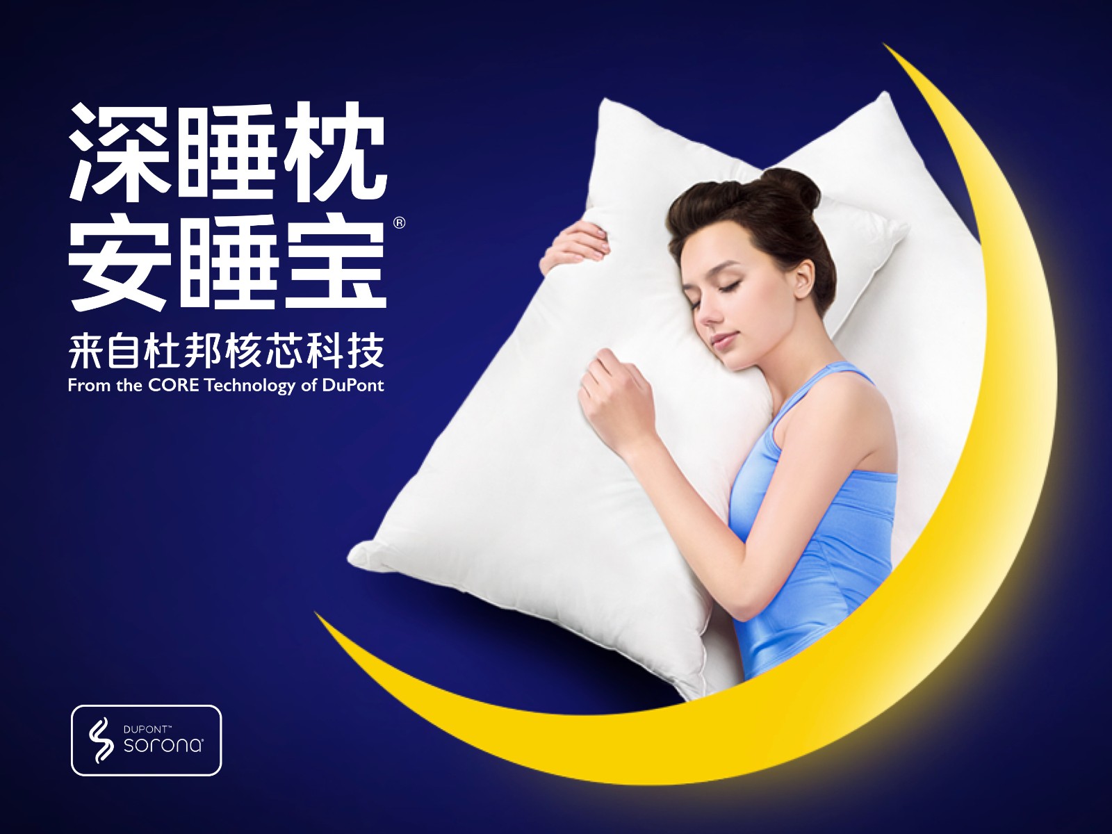
安睡宝,源于美国杜邦公司,是全球著名的科技健康睡眠品牌,其先进的技术、卓越的研发,以及出色的产品设计建立起庞大的用户群体,销售网络遍及包括香港在内的中国60多个大中城市。
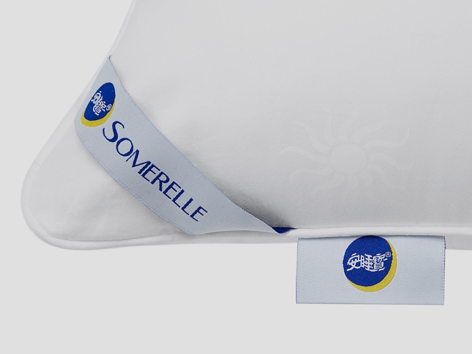
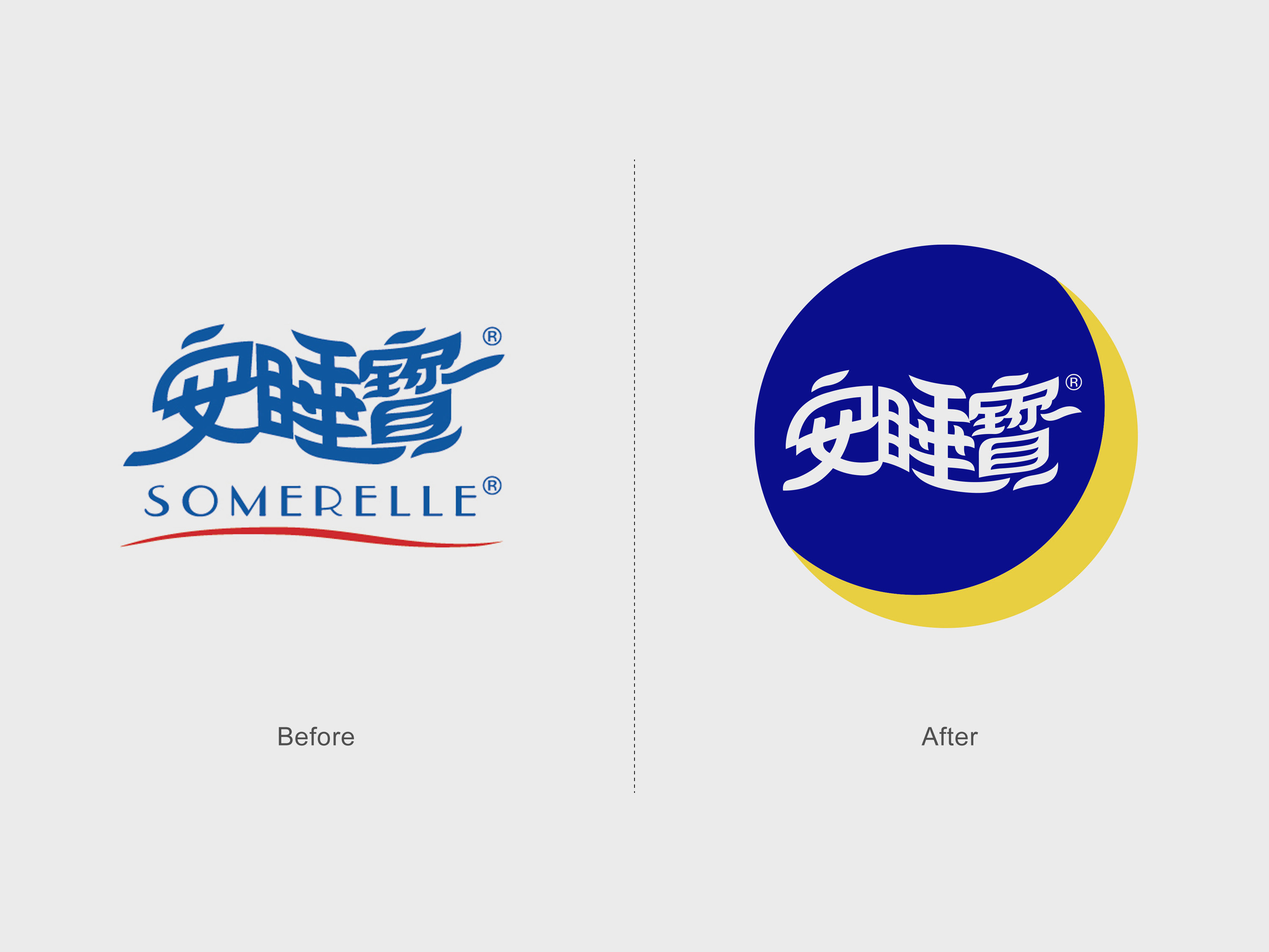
此次品牌升级,贤草以科技、专业、高端化作为导向,进一步为品牌注入时代要素。安睡宝的新标识将中文品牌名融入到一个象征宁静夜晚的圆形蓝色色块中,一轮明黄色的新月增加了优质睡眠的感受。字体柔和飘逸的细节细节被保留,同时,笔画线条的弧线更得到了进一步的精细化,处处展现独特的品牌格调/
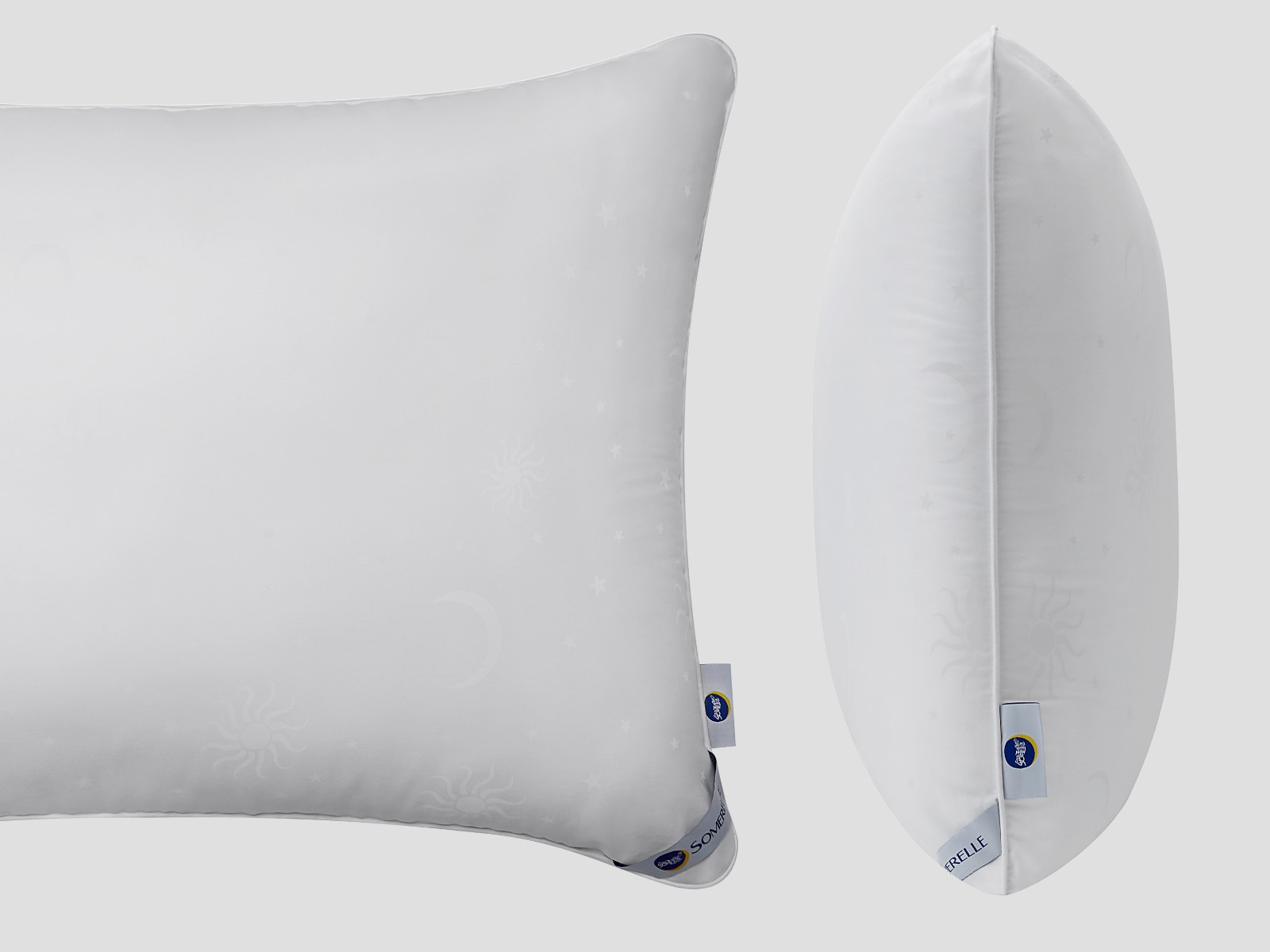
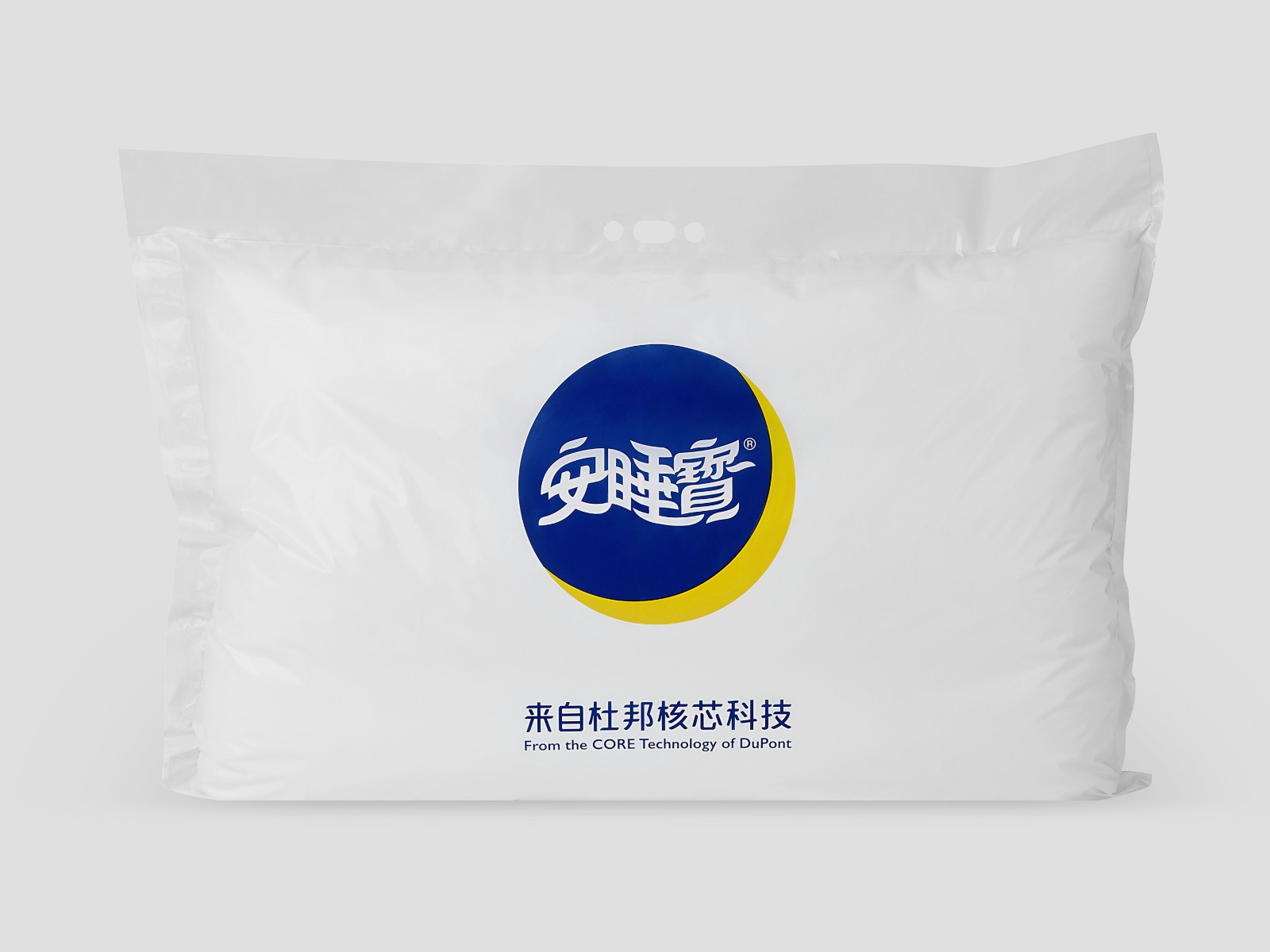
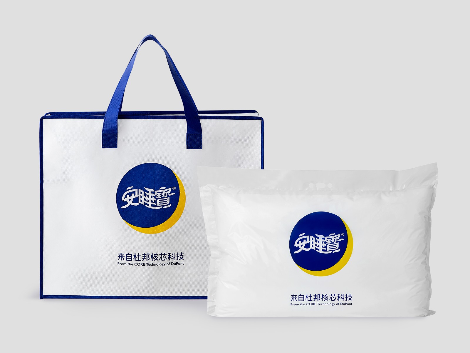
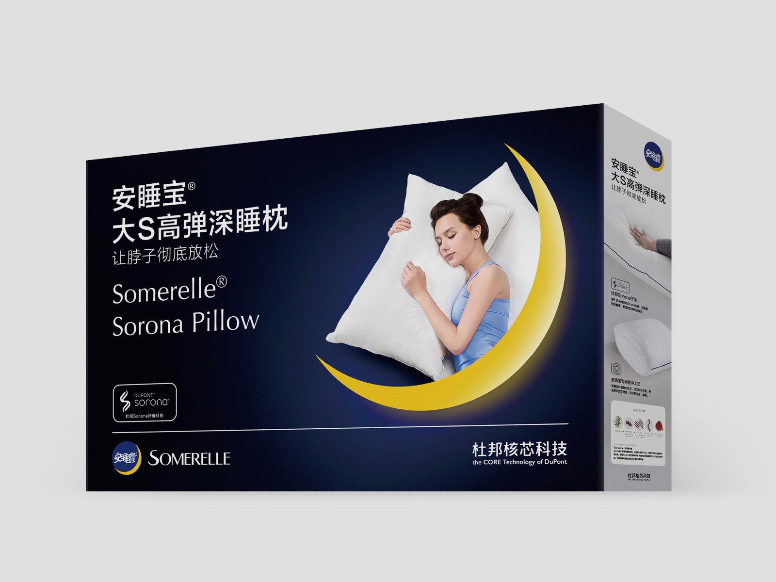
从产品包装、产品画面到各个触点应用,贤草将应用安睡宝科技带来的舒适睡眠,通过视觉语言精准传递给每一位安睡宝的潜在用户。
For this brand upgrade, Visdom takes technology, professionalism and high-end as its orientation, and further injects contemporary elements into the brand. The new logo of Somerelle integrates the Chinese brand name into a round blue block that symbolizes a quiet night, and a bright yellow crescent moon adds to the feeling of high-quality sleep. The soft and elegant details of the font are retained, the arc of the strokes is greatly refined, showing a overall unique brand style.
From product packaging, product images to various touchpoint applications, Visdom will apply the comfortable sleep brought by Somerelle technology to every potential user by the visual language.
客户:安睡宝
时间:2022
团队:Rock、Tina、Tomato
Client:Somerelle
Time:2022
Team:Rock、Tina、Tomato